Premium is not just “expensive”
Plenty of snacks cost more without feeling premium. What actually makes a snack feel elevated is a combination of signals that tell you the product was designed with intention.
Usually, that means the snack delivers on a few layers at once:
- It tastes more specific, not generic.
- It feels better to eat, especially in texture.
- It looks considered, from naming to packaging to photography.
- It has a clear reason to exist, rather than trying to be everything at once.
Best Snack take
Premium is often the feeling that someone made more decisions — and made better ones.
The biggest things that make a snack feel premium
Texture that feels deliberate
Premium snacks often have better mouthfeel: thicker cuts, cleaner crunch, smoother chocolate, or more satisfying bite. Texture is one of the fastest ways people notice quality.
Curation instead of overload
Premium products tend to feel edited. Fewer flavors, clearer positioning, and more confidence usually read better than a crowded assortment.
Packaging that feels useful and memorable
Good premium packaging is not just pretty. It usually makes the product easier or more enjoyable to use, store, or gift.
A brand world people want to belong to
Premium snacks often live inside a more coherent world — one with a tone, a point of view, and a clear sense of taste.
What premium looks like in real brands
You can see these signals more clearly when you compare brands that are deliberately building premium food experiences instead of just competing on utility.
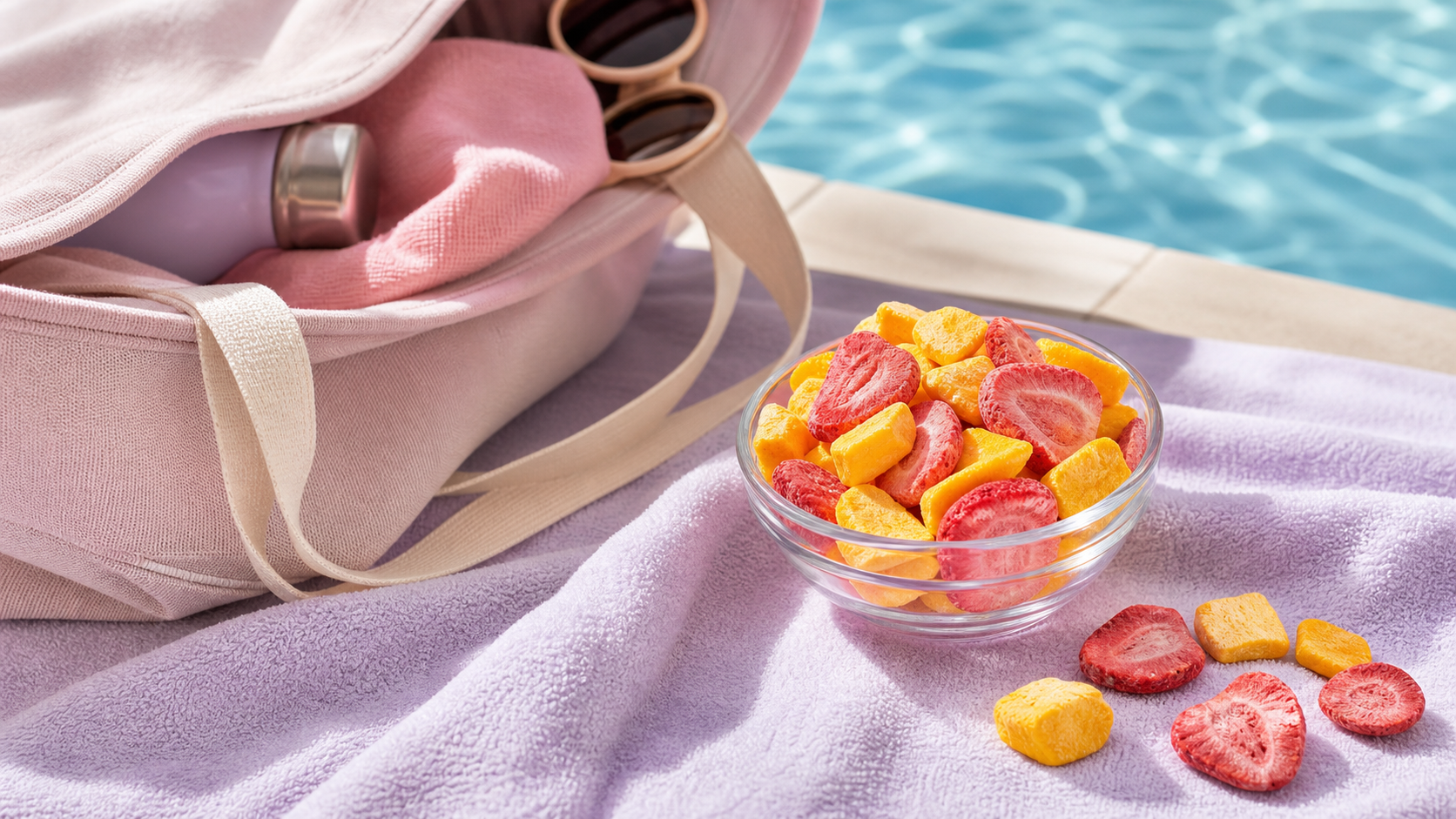
1. OhCrisp shows how texture and cut can elevate a simple category
OhCrisp is a good example because freeze-dried fruit is not automatically premium. What changes the perception is how the product is presented. The brand explicitly describes itself as “an elevated take on freeze-dried snacking,” with “satisfyingly thick-cut crunch,” “thoughtfully curated” mixes, and a “lighter way to snack.” That combination makes the product feel more intentional and more refined than generic freeze-dried fruit.
In other words, premium here comes from better texture, stronger curation, and a more designed overall world — not just from calling fruit “better for you.”
2. Fishwife shows how storytelling can premiumize a pantry staple
Fishwife takes a category that used to feel utilitarian — tinned seafood — and reframes it as ethically sourced, premium, and delicious. That shift is not only about the product. It is also about voice, design, and making the cupboard item feel culturally current.
3. Graza shows how function can be part of premium
Graza is a useful reminder that premium does not have to look formal. The brand emphasizes high-quality olive oil in squeeze bottles and recyclable refill cans, which makes the product feel easier and more fun to use. That convenience becomes part of the premium feeling rather than something separate from it.
4. Bokksu shows how sourcing and maker access create value
Bokksu builds premium through curation and origin. Its premium snack boxes are described as sourcing Japanese snacks from centuries-old family makers and delivering an experience of tasting snacks, candies, and teas sourced directly from Japan. That makes the product feel more like discovery and access, not just consumption.
The pattern
Premium brands usually do not rely on one thing. They stack quality cues: product feel, visual world, sourcing story, and better usability.
So what usually makes a snack feel premium to people?
Our favorite way to judge it
When we try a snack, we usually ask four simple questions:
- Does it feel better in texture than the category average?
- Does the brand seem edited and confident?
- Would this still feel special without shouting about ingredients?
- Would I want to leave this out on a desk, counter, or table?
If the answer is yes to most of those, the snack usually reads premium.
Want to see a fruit snack that leans more premium?
Browse OhCrisp if you want a good example of how better cut, better crunch, and better curation can make a simple snack category feel more elevated.